
I resisted and I love how this came out. Would love to make a slew of them, but at a more normal size!!
Thanks for stopping by. I just love all your comments. Have an awesome day!!

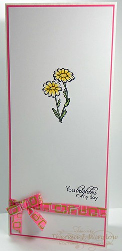
Recipe:
Stamps: There She Goes Clear Stamps (Bloom)
Paper: Bazzill Basics (lilly white & coconut swirl); DCWV (Blossom Song)
Ink: Memento Tuxedo Black; PrismaColour Colored Pencils
Accessories: ribbon (Really Reasonable Ribbon)


11 comments:
So cute!!!
Wow, you certainly rose to the challenge Theresa! This is so pretty. xx
All that white space sings to me! LOL! I LOVE it! Your card is just so pretty!
I am a Denver Native myself! Jealous that you are still there and I am not! I ask my husband everyday if we can move back! One day maybe! Hopefully sooner than later! :)
Thanks for playing along at CAS-ual Fridays!
adorable! that white space scares me!!! good thing all my crafts are still packed up so i have an excuse not to attempt this challenge. haha You nailed it! :D
Hi Theresa :)
Gorgeous card hun, really stylish and eye-catching. All the white space gives me a panic though! :D lol.
I think Michele would hate my blog! :D lol.
Have a great day,
hugs
xxalisonxx
Well I certainly think you did a FINE job of embracing the white space with this beautiful and eye catching card. I love the mix of pink and green with the pop of yellow!
Thanks for playing at CAS-ual Fridays!
I'm loving the white space - you've perfectly balanced all the elements. I would find that so challenging on a long card!
Love that cute ribbon, too :)
This DID come out well! I really like the patterned ribbon too. It adds visual interest but still allows for the "white space" to shine! Thanks for joining us at CAS-ual Fridays this week.
Oh oh oh do I love that fun and modern ribbon! The white space really makes the ribbon and focal image POP!
Oh I like this! So simple and so pretty.
This is so simple and pretty!
Post a Comment